Untitled (Tube Map)

Barbara Kruger

21 May 2010 – 10 January 2011

Part of the following series:

Tube Map

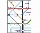
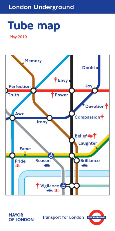
Barbara Kruger uses the language of publicity to draw attention to the manipulative power of advertising. Her trademark subversive tactics are played out in ‘Untitled (Tube Map)’, where the familiar imagery of the map is used to relate her own feelings about London, a city she loves and knows well.

Passengers will be able to pick up Kruger’s map for free at Underground stations from 21 May 2010. The image shows a section of the Tube map in which the station names have been replaced by words that relate to Kruger’s experience of that part of London. Taking the very familiar visual language of the map, she keeps the main image intact but changes the words – still in the classic New Johnston Font – and liberates them from their daily function. St James’s Park is momentarily renamed ‘Fame’, Westminster station becomes ‘Reason’ and Victoria station as ‘Pride’ completes a humorous triangle/set of three.

Kruger’s is the twelfth Pocket Tube Map design to be commissioned by Art on the Underground. Other artists in the series include Jeremy Deller, Richard Long, David Shrigley and Mark Wallinger. The maps are becoming recognised as collectors’ items as the portfolio grows. Available for free from stations across the network, the map has one of the largest print runs for any organisation in Europe, with over five million printed per design and almost 15 million per year.

Although the motivation for a new map is driven by a practical issue, such as a station addition or change, the map covers also tend to communicate something about that moment in time in London, or on the network.

Art on the Underground Curator Sally Shaw says ‘We are excited and privileged to be working with Barbara Kruger on this project. Untitled (Tube Map) presents a subtly humorous and human interpretation of life in the city, navigated via the Tube. I am looking forward very much to hearing what our customers think about Barbara’s work and the others in the series via our website.’

COMPETITION – THE COMPETITION IS NOW CLOSED

Art on the Underground has now commissioned 12 Tube map covers. We asked you to vote for your favourite for a chance to win a numbered limited edition print showing all 12 Tube map covers. Thank you for all your fantastic responses and comments, a selection of which will be published on this site.

The 12 winners have been randomly selected. Congratulations to Araiz Goitia Goyenechea, Holly Poncini, Anne Cheng, Jennifer Smith, Ann Fenech, Robert Chan, Sian Heard, Wendy Law, Dan Crane, Ana Rose Sharkey, Andrew Griffiths, and Mark Clingman.

See terms and conditions

Read More

Comments

  • My favourite tube map is October 2008. It is fantastic!

    Tube Mad

  • really an eye opener for me. – Robson

    rachat credit

  • Found the Tube Map Cover by Barbara Kruger quite inspirational, as well as clever. As a result I’ve written a poem based on it. Anyone like to hear it? Pattie xx

    Pattie Tunnicliffe

  • Barbara Kruger “Tube Map”. Although the basic idea is not absolutely original since it follows the “Great Bear”, the execution and imagination are great here. It enables us to run through the whole range of feelings we have whilst travelling and try to see if her connections are our connections. Interactive art at its best! Expressing a “Truth” with “Reason” and without “Irony” or a reliance on mere “Memory”, I am in “Awe” and full of “Envy” and have no “Doubt”, since the “Brilliance” has brought me “Laughter” and “Joy”, and I hope my “Devotion” and that of others brings her “Pride” and “Fame”, but warn her that a search for “Perfection” always needs “Vigilance”, because “Power” needs a “Belief” in “Compassion”. Richard Baker

    Richard Baker

  • WHAT A STUPID THING TO DO TO PUT SILLY WORDS ON THE TUBE MAP. I WAS TRYING TO LOOK QUICKLY WHILE TRAVELLING TO BE FACED WITH IT. THAT’S NOT ART IT’S STUPIDITY!

    m. del

  • Favourite Tube map cover: Pae White. I love the October 2008 cover because of the symbolism – the magic carpet represents travel, a mythical imagination of what travel should be like, and the tear in the carpet shows that dream being pulled away.

    Sakhr Al-Makhadhi

  • Favourite Tube map cover: Yinka Shonibare, June 2006. It combines the colours of the Underground with a map of the world. Not only does it look striking and pretty cool, but it makes one think of the international, cosmopolitan nature of London; and the role the Underground plays in connecting the people in one of the major cities of the world. It also makes me think of fact that, worldwide, the London Underground is one of the most famous and identifiable parts of the city.

    David MacSorley

  • Earth by Richard Long is my favourite Tube Map Cover because it is bright, colourful and simply beautiful. It uses simple lines, shapes and colours to reduce a very complex thing such as Earth into a simple form. I like that it could have the duel connotation of Earth as a planet or Earth as in the ground, soil or even agriculture with the inherent coloured grid pattern depending on your perspective.

    Sophie Harrington

  • Favourite Tube map cover: Paul Noble, March 2009. It always amazes me what people try to carry on the London underground. As one of the most practical transport options in London, it seems like anything goes. This image always puts me in mind of all these people and the problems encountered when carrying bulky objects on the tube: a sort of memorial to them.

    Ann Fenech

  • Favourite Tube map cover: Pae White, October 2008. A myriad of colourful villages and cultural quarters, woven together by the silken endurance of the Underground. Such is the tapestry of London.

    Leigh McDevitt

  • Favourite Tube map cover: Mark Wallinger, May 2008. Funny, precise, nice.

    Hilary Kirby

  • Favourite Tube map cover: Mark Wallinger, May 2008. I like the simplicity of the Allied Forces rondel/target used during the war being used as a symbol for the underground, where the people of London sheltered during the London Blitz. It  brings it back to a time when the Underground really became a truly important feature for the city of London; not just with helping its citizens move around with ease, but also by protecting them.

    Petra Witowski

  • Favourite Tube map cover: Liam Gillick, January 2007. It reminds us of the excitement and anticipation in the hours before the London Underground opened. It reminds us of the great innovation of this amazing feat of human imagination, will and work. It reminds us to remember its invention, and to not take for granted the freedom it affords. The simple tube-line coloured graphics spelling out the date bring forward the long history of ‘the tube’, literally spelling out its age in a bold, modern font. The textual trigger also takes time to decipher, a puzzle of letters, like the tube lines themselves, that eventually settle into sense as you read the lines on the map.

    Sara Knelman

  • Favourite Tube map cover: Liam Gillick, January 2007. The 1863 cover as I knew exactty what it meant – it was sort of meaningful but quizzical to many who would wonder why but never investigate. Sort of my secret

    Rodney Wolfe Coe

  • My Favourite Tube Map cover has to be the Portrait of John Hough by Jeremy Deller with Paul Ryan because it reflects the devotion that TFL undertake to ensure that commuters reach their respective destinations not only on time but in considerable safety too, working long hours and serving more than a billion passengers as of 2007. In the case of of John Hough for the past 4 and half decades and I do not think TFL staff receive the gratitude they are worthy of so I think the this tube map in particular reflects and applauds this.

    Nick Panteli

  • Favourite Tube map cover: Emma Kay, August 2004. Because it so neatly encapsulates Britishness whilst also referencing the circularity and colour of the Underground

    Paul McMullen

  • Favourite Tube map cover: Emma Kay, August 2004. I like the fact that it brings a bright, Pop Art sensibility to the experience of tube travel in the 21st century. Like the best poster designs, it takes the simple concept of concentric coloured circles to illustrate the network of interconnected tunnels and lines that make up the London Underground.

    Susannah Straughan

  • Favourite Tube map cover: David Shrigley, February 2006. I just love the tangle of colours showing how the tube network is  interwoven underneath London but, by following the right thread, you can always get where you want to go.

    Janice Rosemary Jones

  • David Shrigley, the Map of the London Underground piece represents something much more personal to me than just a Tube Map cover. This was presented on the first Tube Map which I picked up, the first time I had used the London Underground. The scramble of lines, all interfering with one another very accurately symbolises the feelings rushing through my head as I tried to navigate my way through what seemed, at the time, to be a vast complication of trains and tunnels. Four and a bit years on, I use the Tube almost every day; rarely even having to refer to the trusted Tube Map – I probably know it almost as well as the back of my hand. Still having that first tube map stowed away in a drawer, it reminds me of the challenges which I faced after being thrown in a tunnel, armed only with that map. The artwork always reminds me of that, and is one which is unique to me. It will always remain a part of me, and will always be instantly recognisable.

    Ben Smith

  • Favourite Tube map cover: Cornelia Parker, January 2008. I visit London on business. Art on the underground is a guilty pleasure. I look forward to it as part of my trip. It’s free. It’s inspiring. It lightens my load and brightens my day. I know if I lived in London and used the Tube for work I’d be more concerned about delays, but I hope not. Art on the Underground makes the journey and takes me to a different place. Not where I’m travelling to or from but flights of fancy in my mind. In my mind, that’s it. So it has to be Cornelia Parker’s ‘Underground Abstract’. So apt, the Tube colours, emotional states, image association – the Rorschach blot. I hope it helps lift commuters’ heads occasionally to smile and enjoy. I like art and I hope they do too.

    John D Smith

  • Favourite Tube map cover: Barbara Kruger, May 2010. I like this one because it is simple and at a quick glance it looks like the normal Tube map. However, if you look closely you will find the station names are not actually the station names, when I noticed this I found myself thinking about why she chose those particular characteristics and this is a good way to make time go quickly while travelling! I like this one best because it is genuinely related to the underground (which is what it is trying to market) some of the covers just appear to be random.

    Anita Elizabeth Amies

  • Favourite Tube map cover: Barbara Kruger, May 2010. I have chosen it because I love Kruger’s provocative art. In this specific artwork I like her way of playing with a collectively shared code, as the underground map is for londoners and tourists, in order to share such a subjective point of view of the city. She’s telling us that London is all about the infinite dialogue between Public and Private.

    Chiara Camerada

  • Just when I thought ‘bulls eye’ would get my vote I saw Barbara Krugers new ‘untitled’ She has managed to reinvent the map..no small feat.Brilliant!!

    Chris Galloway

Show More