Learning

Projects Resources

Helen Cammock

Art on the Underground presents an ambitious city-wide commission by British artist Helen Cammock, which responds to the events that unfolded in 2020 and 2021. Launched on 28 July 2021 and on view for a year, the commission is exhibited in poster sites in seven Underground stations across London, including Aldgate East, Charing Cross, Earl’s Court, Holland Park, South Kensington, St James’s Park and White City.

For the artist’s first major public commission, Cammock has created three new text-based artworks which reflect on our human response to the events that unfolded in 2020 and 2021: the effects of a global pandemic; the death of George Floyd and subsequent Black Lives Matter protests; the ecological challenges we continue to face; and the inequalities made evident through Covid-19. Her artworks consider the intersectionality of our lives and how our social and political identities are interconnected. Each work references the physical experience of travelling on the Tube, whilst also exploring our emotional response to a year like no other. With her characteristic economy of language, Cammock presents a provocation for a more compassionate future.

The first work in the series reads ‘the edge is never still’, which reflects on the idea of ‘the edge’; the feeling of being ‘on edge’ and how our emotional ‘edge’ is always a shifting site has changed over the past year. The work explores the notion of the edge as being something permeable and constantly evolving over time through our individual experience. It also references the architectural space of the edge of the platform and the edge of the train. We stand in the train on a solid floor and yet the site on which we stand is moving. These edges are doing a dance of transition as we move from one space to another. The second poster in the series reads, ‘glass distortions don’t impair my view merely change it’, which plays on the idea of distortion as negative and how we transform to experience things anew. The artwork references seeing through a lens – or the windows of the Tube – and the idea of living on the inside and looking out.

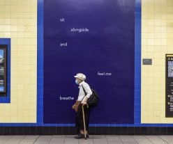
The final artwork in the series reads ‘sit alongside and feel me breathe’ and explores the symbolism of ‘breath’ within crisis, which has recently taken on an increased significance due to the respiratory nature of Covid-19 and the murder of George Floyd. It asks a question about the value and worth we see in (and feel for) others and explores people’s attitude towards the habitation of public space. The artwork explores the concept of empathy and people’s attitude towards public space. Covid-19 has dramatically altered our understanding of other people’s physical presence, however, the Tube is a public space which we inhabit together. Cammock’s artwork metaphorically questions togetherness – as a society can we ‘sit alongside’ one another? The work questions how we can regain the fundamental principles of our social engagement with strangers as we begin to reinhabit shared spaces.

Over the past year, physical and digital public spaces have been filled with instructional messaging, advising on how to behave in the interest of public health. Helen Cammock’s language, tone and the spacing of her words gives pause from this, bringing a human voice to reflect upon how we occupy our environment again. Her commission ruminates on resilience, transition, and collective experience, exploring how people can respond to the events of the last year by coming together and opening ourselves up to the experiences we share.

Sankofa School Poster Competition

Art on the Underground invited a class of year 10 art & design students from Westminster City School to take part in a poster competition inspired by Larry Achiampong’s ambitious public commission, PAN AFRICAN FLAGS FOR THE RELIC TRAVELLERS’ ALLIANCE’ 2019 which reimagined London Underground’s iconic roundel at Westminster Underground station.

The final design was chosen by artist Shepherd Manyika who led a workshop with the students, including portrait drawing, a mapping exercise, a visit to Westminster station, sketching in the surrounding area and responding to a brief.

The brief was to create an image for a poster design inspired by Larry Achiampong’s commission. The students were asked to respond to:

  • The redesign of an iconic London or British design in a way that changes its meaning and makes you feel more represented both culturally and personally;
  • The idea of ‘sankofa’ – using the past to prepare for the future.


The winning design by Niaz Rahman has been produced by a professional designer and will be exhibited at Westminster station throughout the summer.

Niaz said about his work: “My poster design is called ‘Equality’ because it represents people of all ethnicities and sends the message that we should be United. My main idea was to redesign the London Underground roundel, using inspiration from coats of arms I’ve researched from centuries past. I used trains which I distorted using Photoshop and reflected, to create the circle in my design. The bar going through the middle is made of all the different tube lines. On either side of this are perched pigeons, as these became such an iconic part of central London and Trafalgar Square. A British Bulldog slouched on top of my design, representing how Britain’s success rests on the achievements of many cultures. In the background of the poster, I have placed every flag on a low opacity, to allow them to compliment rather than clash with the design. The silhouetted footprints represent our path from the past into the future learning from our mistakes. The slogan I chose to show reads ‘Colours don’t fight they create something new’ because it occurred to me so many things couldn’t be created without colour mixing and there would be so much less variety and interest in life if we didn’t mix and respect each other.”

Elaine Chance, Head of Art at Westminster City School said about the project: “They watched the video of Larry Achiampong’s work and said they liked the way he was fighting for social justice, equality for all with his work, and it had more meaning than they realised when they first saw it. The idea that the colours of the roundel are very imperialist had never struck them so they looked at the colour in Achiampong’s designs and the underground differently following the workshop.”

Shepherd Manyika is a London based artist who works with mixed media. Manyika is interested in representations, drawing narratives from found images and the everyday. Manyika graduated in BA Fine Art at Central Saint Martin’s in 2011 and MA in Academic Practice in Art, Design and Communication, from Central Saint Martins 2019. He exhibited at Royal Academy School of Arts with the Parasites school residency and works on various education programmes across London.

Things Held Fast

Art on the Underground present Things Held Fast, a new large-scale public commission at Brixton Underground station by Australian artist Helen Johnson, on view from 20 May – November 2021. For her first major public commission, Johnson represents Brixton through the lens of a community garden – a shared space of growth that builds over time due to collective commitment.

Johnson’s is the fourth in a series of commissions at Brixton station, following on from Denzil Forrester, Aliza Nisenbaum and Njideka Akunyili Crosby. The programme invites artists to respond to the diverse narratives of the local murals painted in the 1980s, the rapid development of the area and the wider social and political history of mural making.

For her new commission, Things Held Fast, Johnson depicts a group of figures gardening, absorbed in their tasks and conversation and connected by the investment of their shared energies in a communal space. Much of the painting’s imagery is drawn from the Lambeth Archives, which provided insight into organisations, projects and movements that underlie the community at the heart of Brixton. For example, the owl depicted is taken from a protest banner to save Lambeth libraries, children are shown climbing a cherry blossom tree, referencing the Cherry Tree childcare centre that was closed amidst much local protest, and the whirligig beetle and pondlife depicted can all be found in nearby Myatt’s Fields. The painting’s vignettes are signifiers of history, growing and interconnected like plants in the soil. They are represented in fragments and details, but tell the stories of community organisations and movements such as the Lambeth Women’s Project; anti-racist organisations like Unity Centre; gardening groups like the one at Myatt’s Fields Park; or the movement to save local libraries.

Johnson’s commission also explores a common theme in the artist’s practice, the construction of national identity and the legacies of colonisation. Embedded in the layered surface of Things Held Fast, is an image derived from Robert Dodd’s engraving Mutiny on the Bounty (1790), which depicts mutineers ejecting Vice-Admiral William Bligh from his ship. The mutiny took place on a journey to transplant breadfruit trees from Tahiti to the Caribbean as a food source for the enslaved people who were there under British colonial rule. Subsequently, William Bligh was appointed as Governor to the British colony of New South Wales, where he oversaw the dispossession of indigenous peoples and unspeakable violence towards them. Bligh, a resident of Lambeth between 1754-1817, became a negative connection for the artist to Brixton. As a white artist living in Australia, Johnson wanted to acknowledge this colonial history and represent the opposing trajectories of Bligh, who travelled to the Caribbean for purposes of subjugation and dispossession; and the African and Caribbean communities who many years later established themselves in the UK, where, up against hostility and socio-economic inequalities, they continued to foster solidarity and cultivate strong communities.

Research for Things Held Fast began in late 2019 at a moment when Australia was ravaged by one of the worst bushfires in its history. For Johnson, the loss caused by the fires gave rise to appreciation of what remained and what is valuable. The commission was painted in Melbourne, in lockdown during the Covid-19 pandemic; this second challenging context served as a reminder to the artist that community is vital for our sense of collective purpose and wellbeing.

Things Held Fast represents multiple stories, densely layered, that will reveal themselves gradually over time. It does not take a single history or movement as its subject, but rather is a vehicle for thinking about how a multitude of narratives can lay the foundation for something greater.

The 33rd edition of the pocket tube map cover by Phyllida Barlow, a bright yellow artwork overlaid with colourful geometric shapes mimicking tube tunnels, in the hand of a member of the public.

helter skelter

Phyllida Barlow, helter skelter, is the new cover commission for the 33rd edition of the pocket Tube map series commissioned by Art on the Underground, for Transport for London.

Made in lockdown during the Covid-19 pandemic helter skelter is a new work on paper that marks the instability of our time. Comprised of Barlow’s signature bold colours and shapes, helter skelter is a tower of platforms and tubes balanced precariously on top of one another, on the brink of collapse.

The ramp, the barrier and the tower are forms that have appeared repeatedly in Barlow’s work throughout her 50-year career and are reflected here in an array of pink, blue, purple, orange and red colours in acrylic and pencil on paper. Barlow is captivated by the idea of being both physically and metaphorically on the edge of breaking. How things collapse, deteriorate and are then repaired forms a central tenet of the work which the artist sees as a great metaphor for the human condition and our current time.

helter skelter mimics the Underground architecture with an energy and urgency much celebrated in Barlow’s wider practice. Renowned for sculpture as well as works on paper, Barlow’s practice encourages us to experience her work physically. There is an expediency to how she works both on paper and via the materials she uses in her sculptures. Recycled timbre, scree, concrete, plaster, polystyrene and expanding foam create unapologetic, adventurous and gigantic gargantuan forms. Her works recontextualise and displace objects, rendering them useless and absurd. Looking at the city is an important source of inspiration for these works and drawing, a method for realising these ideas.

Barlow is interested in opposites in her work – thrilling but dangerous, towering and precarious – as a metaphor for how we live. She allows us to experience both the precarity and absurdity of the world with a great humour and pathos that couldn’t feel more timely.

The new tube map cover, an abstract geometric collage by artist Elisabeth Wild.

Fantasías

Fantasías by Elisabeth Wild is a new collage artwork made for the cover of London Underground’s iconic pocket Tube map. The 32nd in a series commissioned since 2003, Wild joins a roster of leading international artists who have made work for this site including Linder, Laure Prouvost, Geta Bratescu, Marc Camille Chaimowicz and Barbara Kruger.

The Tube map cover is the final commission by Wild before her recent passing in February 2020 and forms part of the artist’s long-standing collage series Fantasías. Established out of a daily practice, each work in the series is made from the pages of glossy lifestyle, fashion, architecture and art magazines where Wild would identify forms and colours that she cut with scissors and reconstituted into new abstract compositions. She worked from an archive of these cuttings, using her glue stick to layer shapes and a multitude of colours. To Wild, the process of perfecting her collages was an intuitive act. She avoided direct reference to the consumer objects from the pages, cutting her own shapes, turning the advertisements from images of extravagance into imagined objects, architectures or cityscapes in their own right.

For the Tube map cover, the influence of Graphic Modernism and Constructivism are present – lines run vertically, horizontally and intersect to make geometric shapes that form a tower-like structure. The edges of these small shapes are irregular and angular and at times placed just off-kilter, a reminder of Wild’s 98 year old hand.  The resulting artwork is an imagined monument in London Underground’s infamous blue and red palette. For Wild that millions of these maps will be printed and distributed throughout London was thrilling and a small nod to the Constructivists who believed passionately in the translation of ideas and design into mass production, out of the artist’s studio and into the hands of millions.

Pleasure’s Inaccuracies

In 2020, Art on the Underground presented a large-scale public commission of permanent and temporary artworks by Scottish-born, Belgium-based artist Lucy McKenzie, titled Pleasure’s Inaccuracies.

McKenzie is fascinated by the decoration of public spaces such as train stations, and her work frequently combines source material from the realms of historical design, advertising and architecture. For what was her most ambitious public commission to date, she chose Sudbury Town Tube station, a historic, listed building designed by Charles Holden in 1931, for its location and architecture. Situated outside of central London, with a cavernous main hall, original features and waiting rooms on each platform, the station is evocative of another era. 

By respecting Sudbury Town’s original design, McKenzie’s commission reflects the present through the aesthetics of the past. The commission comprised a number of elements: two permanent hand-painted ceiling murals featuring maps of the local area; a highly detailed architectural model of the station which will remain on permanent display; two large billboards installed on each platform; and a series of posters which was on display until April 2022.

Morden

For the 31st edition of the Pocket Tube map, Art on the Underground have commissioned a new work by Welsh artist Bedwyr Williams. As the UK approach leaving the European Union and move towards an uncertain future, this commission is part of a year-long programme which brings together international artists to explore the emotional weight of longing and belonging to the city as it crosses this edge.

Sunset, Sunrise, Sunset

Art on the Underground commissioned artist Alexandre da Cunha to create a permanent artwork for the Northern Line Extension. Da Cunha’s work is installed at the new Underground station at Battersea Power Station, which opened on 20 September 2021.

‘Sunset, Sunrise, Sunset’ is a monumental kinetic sculpture reflecting on daily cycles. Stretching 100m and 60m in length, the artwork incorporates two friezes that face each other along the length of the ticket hall. Made using an outdated advertising mechanism – the rotating billboard – Alexandre da Cunha has created a moving sculpture. The artwork was inspired by the former control room at Battersea Power Station and its system of vertical bars that regulated the production and output of electricity into the city. Bringing these resonances together with the daily flow of dawn to dusk, Sunset, Sunrise, Sunset refers to cycles, routine, the everyday and eternity.

The friezes consist of three faces of different colours, gradually fading from one colour to another over the length of the entire panel. The colours are informed by London sunsets and sunrises. Throughout the course of the day the panels rotate, seemingly at random, presenting different combinations of colours into the ticket hall. The long strip of gradient colours creates an illusion of a large window to a dramatic sky.

The three words of the title refer to the three faces of the vertical panels, their cyclical rotation and repetition. With over 3,500 individual colour panels, Sunset, Sunrise, Sunset creates an ever-changing environment within the station.

Brixton Blue

Art on the Underground commissioned Grenada-born, British artist Denzil Forrester to create a large-scale public artwork for Brixton station, on view from 19 September 2019 until Spring 2021.

Forrester is the third commission in a new series at Brixton, following on from Njideka Akunyili Crosby in 2018 and Aliza Nisenbaum in 2019. The programme selects artists to respond to the diverse narratives of the murals from the 1980s, the rapid development of the area and the wider social and political history of mural making.

For his first major UK public commission, Forrester has reinterpreted his seminal work ‘Three Wicked Men’ (1982), now in the collection of Tate, London, into an immersive, large-scale painting. Made during his time at the Royal College of Art, Forrester has returned to ‘Three Wicked Men’ several times over the decades. The title was borrowed from a track by Reggae George, released a year earlier, in which Forrester identifies the three men as a policeman, a politician and a businessman. In Forrester’s painted versions, the latter figure is often replaced by a Rasta. Reflective of the contemporary black experience and the racial tensions of the time, the painting features Winston Rose; a friend of Forrester’s who died whilst under police restraint in 1981 and which would continue to haunt many of his paintings for the next decade.

You are deeper than what you think

‘You are deeper than what you think’ by Laure Prouvost is the artist’s first public commission in the UK, an ambitious city-wide series of posters infiltrating advertising sites across all 270 London Underground stations.

Prouvost has created posters in print, for digital screens and the cover of six million pocket Tube maps as well as major installations at Heathrow and Stratford stations that bookend the project from east to west London. In these sites the artist draws on her own tradition of sign-painting alongside London Underground’s early history of wayfinding and graphic design, where signs were produced by hand. Each poster is a digital reproduction of a hand-painted sign complete with a sentence devised specifically for the Underground in its iconic Johnston typeface, with corporate logos painted too.

Synonymous with Prouvost’s distinctly playful and poetic voice where English is her second language, the crux of the project begins with the poster ‘you are deeper than what you think’, an interplay between the literal place the work will be encountered and a reminder that there is more inside all of us than we might initially feel. Further works include ‘oh stay with us the party has just begun’ that fills the atrium at Heathrow station and ‘ideally these words would pause everything now’ a 20 metre sign at Stratford station that directly addresses the millions of passengers who commute through Stratford station each day.

If you have any questions please do not hesitate to contact us via email. Thank you for supporting Art on the Underground.

Join the Art on the Underground mailing list to keep up to date with our latest commissions and edition sales: